Brand Lead, Project Manager
Responsibilities: Project management, brand strategy, communication design, stakeholder management, content development, graphic design
The Gehl Rebrand included new logo, typefaces, color palette, image guidelines, and visual illustrations.
-
Evolving the visual identity of an iconic ‘life-centered’ urban planning and design brand to reflect its unique expertise and global reach.
-
Stamp quality with a human touch
-
-
New vibrant palette of colors to support the ‘life-centered’ experience.
-
A layered approach to reflect impacts on ‘People, Place, and Planet’
-
Layering the diversity of the everyday

Strategic Direction
From academic architectural practice, to an engaging strategy and design group.
From ‘people-first,’ to life-centered.
From Danish-design leaders, to a diverse global team of best-in-class experts.
Logo
Stamp quality with a human touch
Building on the company’s existing visual traditions, the new logo takes a wider, more grounded stance on the prior DIN-based logotype through the use of the clean, design-savvy Studio 6 typeface.
This bold, yet playful choice, reflects the approachable tenor of the brand, its ‘life-first’ value proposition, and its confidence as a team of global experts.
Typefaces
Visualizing an expert voice and tone
Highly readable and approachable, Studio6 is a flexible typeface: versatile and contemporary, while still remaining utilitarian and practical.
Times Now offers a fresh take on the robust, authoritative qualities of traditional Times type, offering an editorial look that lends a professional, trusted quality to our identity.


Color Palette
Reflective of real and aspirational places
The new Gehl palette is built around warm tones that offer a range of natural hues, a departure from the company’s previous loyalty to the cool and stoic ‘nordic blue.’
This earthy palette further differentiates Gehl and reflects a realistic and aspirational range of colors in tune with day-to-day life and those tones we’d most like to see in cities around the world.

Image Guidelines
People, Place, Planet
The image styling within the new brand draws from Gehl’s ‘People, Place, Planet’ value proposition.
The layered images reflect these different scales of impact: the expansive public-facing nature of Gehl projects, that are brought to life by the eye-level experience in which individuals and their unique behavioral patterns bring these places to life.
Ex. Bassin 7 Waterfront, Aarhus, Denmark, 2014-2018
Image credits: [Top] Nybolig og Helene Høyer Mikkelsen; [Bottom] SLETH

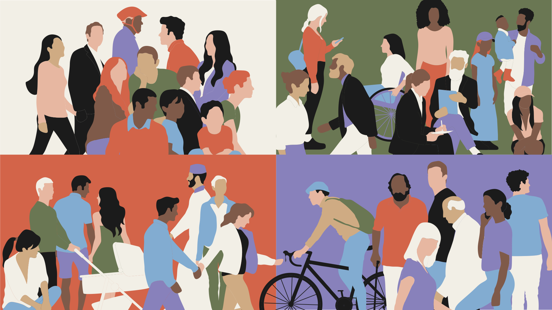
Visual Illustrations
Layering the diversity of the everyday
Gehl’s rich history of people icons used across project work to illustrate visionary plans and activated spaces inspired the new brand level illustrations. These new illustrations build upon the layered image treatment while taking a softer-edged, abstract approach to create composite scenes of a diversity day-to-day movements and activities in possible urban environments.